When I started writing this post, I thought I was analyzing the difference between working in a large physical space with working in a seemingly infinite virtual space. After all, when I start a new notebook or prototype in VR I am often deposited in a mostly blank environment with only a far-off horizon and basic floor to stave off the disconcerting sensation of floating in nothingness. But once I was in the thick of the research, I realized that (for once) scale was not the primary factor in determining my work process. It was the presence of a pre-made environment, whether physical or virtual.
But we are not comparing ample pre-made worlds to truly blank states. The physical world never doles out a blank slate. Architects, for example, must contend with preexisting hillsides and street layouts and building codes and expectations for what constitutes a useful building or appropriate home. Neither are Blank VR environments context free zones. Users must adapt to both the limited functionality and affordances app creators and headsets provide, as well the mood, temperature, and every other aspect of the physical space in which the headset is used You try playing VRchat in a dimly lit shack on a stormy night without taking your headset off every time a branch creeks.
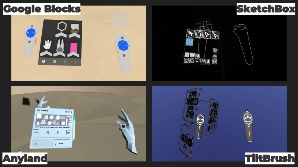
But despite that, I frequently encounter VR spaces devoid of physical world simulacra in software categorized as “creative” or “artistic,” where we assume people will be best served by blank canvases. TiltBrush, A-painter, Anyland, Altspace, Google Blocks, Unbound, Maquette, Gravity Sketch, Oculus Medium, and SculptVR all make this choice.
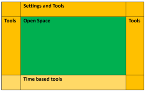
The decision to go with blank spaces seems reasonable enough. Maya, Blender and Unity, the leading software for making 3D things on 2D screens, all start you off in a blank expanse with a grid floor. But if we zoom out a tad and look at Blenders entire interface, we see a blank space surrounded by spatially organized buttons for various tools.

When that same blank space is used in a VR environment all those buttons usually get crammed into a few flat panels stuck to the non-dominant (in my case left) hand. This interface pattern is often referred to as “the palette” in reference to an oil painter’s handheld mixing palette, but I prefer “interface elephantiasis.”

This skeuomorphism’s relationship to painting is thin. Because unlike the VR implementation in which all functionalities are fixed into this one tight space, in a painters studio the palette would only be one tool at one station and only held in the hand during specific parts of the making process and only by specific styles of painters.
So if the goal is to imbue VR and AR tools with as much creative and productive flexibility as possible, we need to remember that blank canvases live inside places rich with spatial context, tools, and references. People don’t storm into pristine studios or gallery spaces and start their latest masterpiece, they set the stage for their process by creating an environment that will support the kind of things they are interested in making.
So why aren’t we doing that same stage setting in our VR studios?
Working in a somewhere
I never realized how blank and empty I’d left my VR working environments until I visited Evelyn’s barn near Boston for the first time. I was there to test out our first MRE prototype and experiment with building installations in a larger physical space than I’ve had access to before. My studio at home in San Francisco is a 100 sqft chuck carved out of our garage. The ceilings are low, and the small window leaves the room in a cave-like dusk most of the year. I’m lucky to have a space of my own in a city with such drastic real estate issues, and I love this tiny space, every tool and supply I need within arms reach. But having adapted to such a small working environment, walking into Evelyn’s beautiful high-ceilinged 1000sq space, originally used for horses and tack, was both eye and body opening.
The smooth concrete floors hosted plenty of open area for me to experiment with large-scale installations as well as a library of tools and supplies. It was awash in a clean white light that makes photos in the space sing with color. The sound of the wind scrubbing the trees of November’s last golden leaves mixed with the friendly hum of the family of space heaters dotted around the room. It smelled of fall and dog and paint markers.
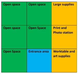
Evelyn arranged the barn into a 3 by 3 grid (~1000 sqft)

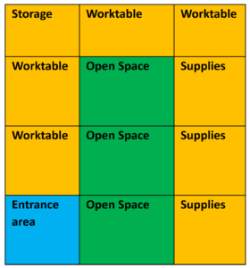
For comparison this is how my studio is laid out (~100 sqft)

Turns out: While people arrange their physical spaces lots of different ways, they do tend to have some similarities. Both Evelyn and I have clumped our open spaces and edged them with tools, tables, and supplies allowing these support spaces to act as creative scaffolds when starting something new.
Her barn was a whole place, real and inviting with its large open areas standing ready for me. This was a place before I came, and would be one long after I left. I spent the week I was there climbing ladders and hanging strings, drawing on plastic and shaping paper, and pacing out measurements trying to map AR units to physical ones. It was a process of response rather than one of invention, a process of learning and adaptation rather than direction and execution. To quote Evelyn’s recent post in which she describes using 3D models in AR as references for making physical sculptures, the benefits of the reference are simple but deep: “I don’t have to imagine the form, and instead I can spend more time responding to what’s in front of me. It’s liberating.”
And space can act as reference material just like images and objects, whether physical or virtual.
I am not arguing that all creative and productivity-focused software in VR should restrict users to creating inside of pre-made environments, but that there is more to enabling rich, active, creative, and collaborative spaces than blank space and a few tools. How do we make interfaces in VR and AR that enable people to set up their own studio and working contexts, make changes over time, play with ways others have tried before and just make messes their virtual spaces?
Spatial Logics
With current creative VR interface designs, when I am presented with a vast blank space as a user, I do not immediately think to build myself a workshop or studio. My first VR notebooks use an elaborate navigation system using calendars and icons and teleporters to keep track of my spatial notes and sketches, but each day’s work hovered on an island out of context from the overall collection. The spaces were part book logic, indexed pages allowing for jumping directly to specific content, and part temporal logic, preserving when things were made, and privileging adjacency between temporal neighbors over other logics.
When I use book logic in my physical studio it is not the overall space that gets indexed and separated into pages but instead just components of it: journals, research, sketchbooks and paper materials. They can be fished off a shelf, expanded to working size, changed or referenced or both, then folded away again. This ability creates a kind of temporary collage, with multiple books and pages open side by side or in a messy heap on top of each other, each holdable-scale object coming into temporary relationships before being stored or moved into new relationships.
In physical space these object relationships don’t happen floating in midair, they come together at stations that have been set up for that, and lots of other overlapping, purposes. In the barn I made stations with specific tools and materials for working on a specific idea, the center dedicated to my initially planned large-scale paper and string installation with spin-off ideas scattered around the perimeter. In my physical studio at home I have a station for sewing and working with fabric, one for drawing, collage and working with 2D paper, an area for working with paper in 3D forms, and one for tasks like video editing, 3D modeling, and AI training that require a powerful computer. Some of these stations, like my sewing table, can quickly reorganize to do double duty for writing or taking meetings. Some are collapsible, like my ironing board, which does get used for ironing but more often expands my 2D paper workspace. But the computer workstation never reshapes to accommodate other materials, it already contains multiple activities.
We can bring all these qualities to our design of VR and AR software, but we’ve yet to reshape our design patterns to support this kind of work. My next challenge will be to create a prototype of a composable station-based world building tool which rethinks how people access, use, and organize the spaces and functionalities current tools offer. My goal is to find more detailed iterations of Studio Metaphor interface patterns that will enable people not only to create their own virtual working spaces but to expand the kinds of work that can be there.

